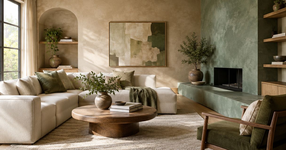
Best overall: warm ivory. Best for a cocooning living room: muted taupe. Best for a feature wall: charcoal. These are the best Venetian plaster colors for living rooms in 2026 when you choose for the room’s light, existing materials, and intended mood—not just a swatch.
- Warm ivory leads the best venetian plaster colors for living rooms when you want a light, neutral backdrop.
- Choose muted taupe for an enveloping room, sage for botanical interiors, and charcoal for a defined feature wall.
- Venetian plaster color and surface sheen need approval together; a flat color swatch cannot show both.
- Luxury Fly Services offers Venetian plaster wall finishes for Connecticut residential and commercial clients.
Why this matters
Venetian plaster is a finish, not simply a color choice. Trowel movement and surface sheen affect how you see the wall, so the same color family can produce a quiet backdrop or a more noticeable decorative surface.
Luxury Fly Services is a Venetian plaster contractor for Connecticut homeowners planning decorative wall finishes. The contractor, based in Southington, also offers epoxy flooring, microcement, and garage transformations. Visit Luxury Fly Services to discuss the intended finish rather than treating a color name as a complete specification.
For your living room, start with the elements that will remain: flooring, upholstery, fireplace materials, and lighting. A plaster sample needs to work beside those surfaces, not only against a white showroom wall.
What makes the best Venetian plaster living room color?
Use these criteria to choose your 2026 shortlist before comparing individual shades:
- Undertone fit: Compare the plaster with your largest fixed surfaces. Look for unwanted pink, yellow, green, or blue contrasts.
- Daylight response: Assess the sample beside the actual windows and in the room’s shaded areas.
- Evening appearance: Check the finish under the lamps you use, not only under daylight.
- Surface movement: Decide whether visible trowel variation should attract attention or recede behind furnishings.
- Wall coverage: Separate a whole-room choice from a fireplace surround or single feature wall.
- Maintenance expectations: Ask how the proposed finish should be cleaned and repaired. Color alone does not establish either requirement.
Venetian plaster colors at a glance
| Color | Best for | Standout quality | Key limitation |
|---|---|---|---|
| Warm ivory | A versatile whole-room backdrop | Soft warmth without a strongly colored wall | Can look too yellow beside cool white finishes |
| Muted taupe | An enveloping seating room | A neutral bridge between brown and gray | Can appear muddy beside conflicting undertones |
| Soft greige | Rooms mixing warm and cool materials | A restrained middle ground | Can look indecisive without a clear undertone |
| Muted sage | Botanical, nature-led interiors | Gentle green color with decorative depth | Can compete with other greens |
| Dusty terracotta | Earthy rooms with warm materials | A distinct clay-like color direction | Commits the room to a warmer palette |
| Pale stone gray | Cool, restrained interiors | A mineral-looking neutral backdrop | Can feel cold beside cool lighting |
| Charcoal | A defined feature wall | Strong contrast and visible wall presence | Requires deliberate lighting and placement |
These names describe color families, not standardized formulas. Ask for a physical sample of the actual proposed finish; two samples called warm ivory do not necessarily share the same undertone or sheen.
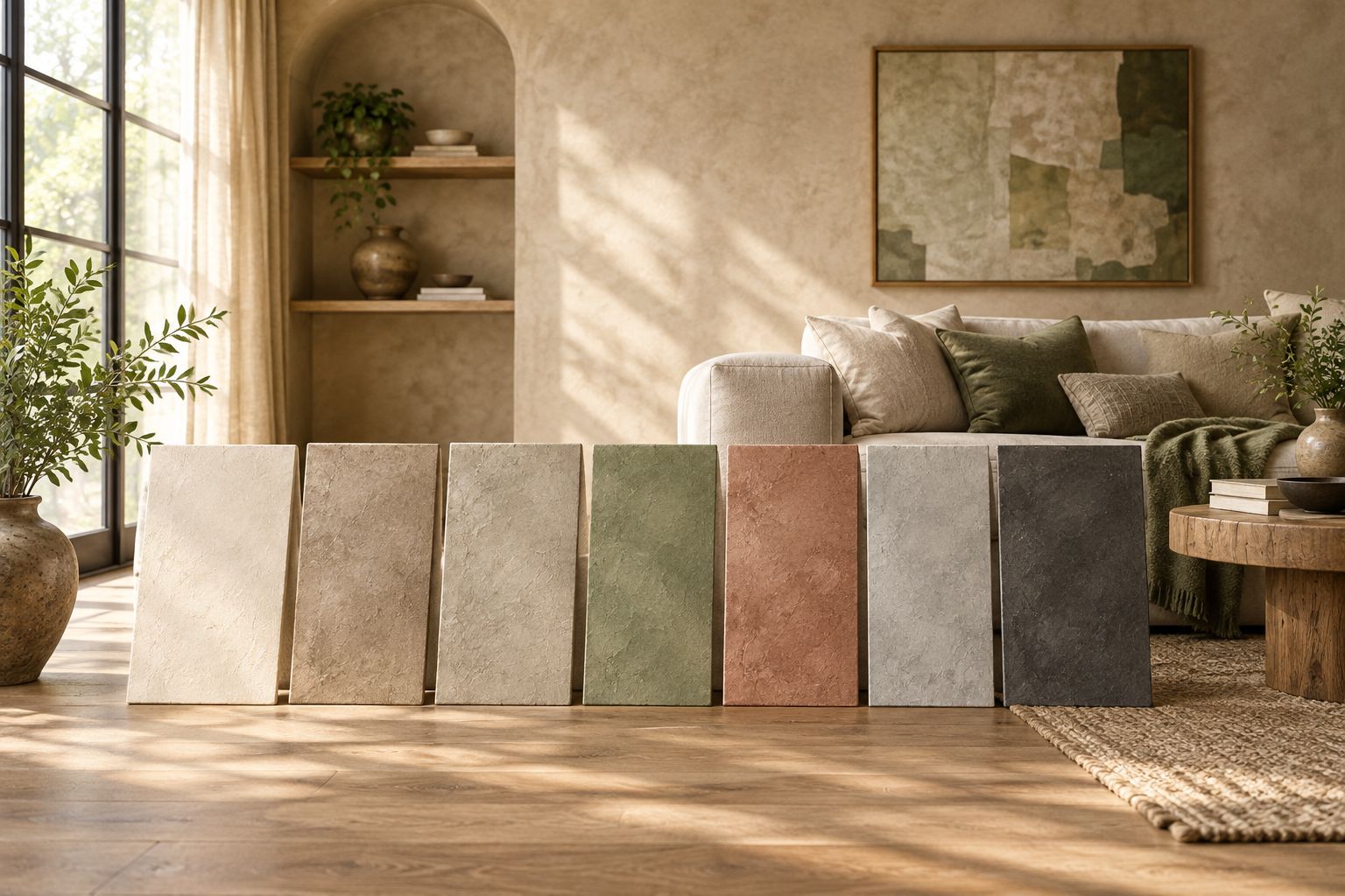
1. Warm ivory: best for a versatile whole-room backdrop
Warm ivory is the default recommendation when you want Venetian plaster texture without making wall color the room’s main feature. It gives you a light background for wood, textiles, and artwork while avoiding the sharper appearance of a stark white.
Choose the undertone carefully. An ivory that looks balanced beside warm oak can appear yellow beside a cool white cabinet or stone surround.
Warm ivory pros:
- Keeps the wall color visually restrained.
- Suits a texture-first decorating approach.
- Leaves room for stronger furniture and textile colors.
Warm ivory cons:
- Yellow undertones can clash with cool whites.
- Subtle plaster movement is less prominent when contrast is low.
Best for: Living rooms where the walls should support the furniture rather than compete with it.
Verdict: Buy into warm ivory as your starting sample, then approve the undertone in the room.
2. Muted taupe: best for an enveloping seating room
Muted taupe sits between brown and gray, making it a useful direction when you want a deeper neutral than ivory. It suits a living room organized around conversation, reading, and a deliberately enclosed atmosphere.
Do not choose taupe from its name alone. Some versions lean pink or violet, while others lean green or brown; compare the sample directly with your sofa and flooring.
Muted taupe pros:
- Creates a more enveloping wall color than a pale neutral.
- Connects brown and gray elements when undertones align.
- Lets plaster movement remain part of a restrained palette.
Muted taupe cons:
- Conflicting undertones can make the wall look muddy.
- A deeper sample needs a separate evening-light check.
Best for: A seating-focused room where atmosphere matters more than an airy appearance.
Verdict: Buy into muted taupe for an intentional cocooning scheme; skip it as an untested neutral compromise.
3. Soft greige: best for mixed warm and cool materials
Soft greige is the middle-ground choice when your living room combines warm wood with gray upholstery or cooler architectural details. The goal is not to match everything exactly, but to avoid introducing another strongly competing color.
Give the sample a clear reference point. Decide whether it needs to relate more closely to the floor, the fireplace, or the largest upholstered piece.
Soft greige pros:
- Offers a restrained alternative to obvious beige or gray.
- Supports rooms with mixed material temperatures.
- Keeps the overall scheme relatively neutral.
Soft greige cons:
- An unclear undertone can make the scheme feel unresolved.
- A small swatch can conceal an unwanted green or pink cast.
Best for: Living rooms combining existing warm and cool finishes that cannot all be changed.
Verdict: Buy into soft greige only after identifying the fixed surface it needs to complement.
4. Muted sage: best for botanical interiors
Muted sage introduces green without demanding the intensity of a saturated accent color. Use it when plants, natural textiles, and wood are already central to the room’s design.
Keep the surrounding palette deliberate. A sage wall does not automatically coordinate with every green fabric, plant pot, or patterned rug.
Muted sage pros:
- Adds recognizable color while remaining subdued.
- Supports a nature-led decorating direction.
- Offers an alternative to an entirely beige or gray room.
Muted sage cons:
- Competing green undertones can look mismatched.
- Green-tinted upholstery requires direct sample comparison.
Best for: A living room where botanical color is an intentional part of the scheme.
Verdict: Buy into muted sage when green belongs in the room’s main palette, not just its accessories.
5. Dusty terracotta: best for earthy, warm-material rooms
Dusty terracotta makes wall color a deliberate design decision. Its clay-like direction works as a starting point for rooms built around warm wood, woven textiles, and earthy accents.
Treat it as a stronger commitment than ivory or greige. Decide whether you want that warmth around the entire seating area or concentrated on a single architectural surface.
Dusty terracotta pros:
- Gives the room a distinct earthy color direction.
- Makes the plaster finish a visible design element.
- Supports a palette centered on warm materials.
Dusty terracotta cons:
- Limits flexibility if you later want a predominantly cool scheme.
- Strong orange or pink undertones need careful checking.
Best for: Living rooms where a warm, earthy palette is the main objective.
Verdict: Buy into dusty terracotta for a committed warm scheme; skip it if you want an unobtrusive neutral.
6. Pale stone gray: best for cool, restrained interiors
Pale stone gray suits a room where cooler stone, metal details, and restrained furnishings already set the direction. Choose it for that relationship, rather than assuming gray is automatically neutral beside every material.
Check the wall against your evening lighting. A sample that appears balanced in daylight can feel too cool once the windows stop providing light.
Pale stone gray pros:
- Supports a cool, restrained material palette.
- Offers a mineral-looking alternative to warm neutrals.
- Keeps attention on shape, texture, and furniture placement.
Pale stone gray cons:
- Can feel cold alongside cool lighting and sparse furnishings.
- Blue or green undertones can conflict with warm fixed surfaces.
Best for: Living rooms already organized around cooler architectural materials.
Verdict: Buy into pale stone gray when the existing room supports it; skip it as a universal safe choice.
7. Charcoal: best for a defined feature wall
Charcoal gives a plaster wall strong visual presence. Use it where you want a specific surface—such as the wall behind a seating arrangement—to become the room’s focal point.
Plan the lighting before approving the color. A dark wall and visible plaster movement create a different effect from a pale, quiet background.
Charcoal pros:
- Establishes a clear focal surface.
- Creates strong contrast with lighter furnishings.
- Makes the wall finish an intentional part of the design.
Charcoal cons:
- Reduces the light, open appearance of a pale wall.
- Strong contrast can reveal uneven-looking surface variation.
Best for: A single, deliberately selected feature wall with a considered lighting plan.
Verdict: Buy into charcoal for controlled emphasis; skip it as the default for an undecided whole-room scheme.
How to approve your plaster color
For a 2026 living room project, use 3 sample boards to compare your leading choices. Keep the proposed texture and sheen consistent so you can judge color without changing every variable at once.
- Compare materials: Place the boards beside the sofa, flooring, and fireplace finish.
- Check daylight: Move the boards between the window wall and a shaded wall.
- Check lamps: Review the same boards under your normal evening lighting.
- Confirm texture: Look from 2 viewing distances: your normal seat and close enough to inspect the surface.
- Record approval: Assess the samples over 1 full day, then record the chosen color, texture, and sheen together.
Luxury Fly Services offers Venetian plaster wall finishes; ask about the proposed sampling and approval process before installation. A color selection is incomplete until you know which surface appearance you are approving.
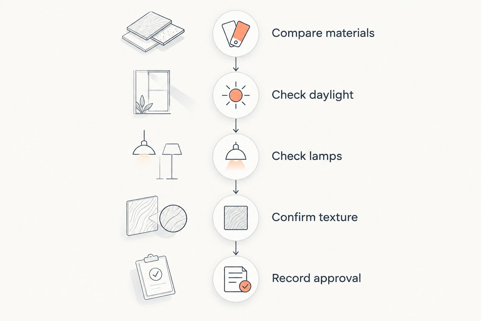
Sample boards help you compare options, but a larger wall introduces more surface area and changing light. Ask how the approved sample will guide the finished wall and how expected variation will be discussed.
Discuss your Venetian plaster finish
Talk through a Connecticut living room project and the color, texture, and sheen you want.
How the colors are ranked
This 2026 ranking prioritizes whole-room versatility first, then assigns distinct roles to more specific colors. Warm ivory leads because it offers a restrained starting direction; charcoal ranks as a feature-wall choice rather than a competing whole-room default.
The ranking follows undertone fit, lighting, surface movement, coverage, and maintenance questions. It is a design decision guide, not a claim that one pigment formula outperforms another.
Which Venetian plaster color should you choose?
Choose warm ivory if you are undecided. Sample muted taupe instead when an enveloping atmosphere is the priority, or soft greige when existing warm and cool materials need a quieter connection.
For a more specific direction, choose sage for botanical color, terracotta for earthy warmth, stone gray for a cool scheme, or charcoal for a focal wall. Your 2026 choice should follow the room you have—not a color trend detached from its surroundings.
FAQ
What's the best Venetian plaster color for a living room in 2026?
Warm ivory is the default recommendation for a light, restrained whole-room backdrop. Check its undertone beside your flooring, upholstery, and fixed white finishes before approval.
Is taupe or greige better for a living room?
Choose muted taupe for an enveloping atmosphere and soft greige for a room mixing warm and cool materials. Compare actual finish samples because both color names cover different undertones.
Can I use dark Venetian plaster in a small living room?
Yes, if a dark, enclosing effect is intentional. Sample charcoal on the intended surface and check it from your normal seating position under daylight and evening lamps.
Should Venetian plaster be glossy in a living room?
Choose sheen according to how much surface reflection and movement you want to see. Approve the proposed sheen on the color sample rather than choosing it separately.
Does Venetian plaster look different at night?
Venetian plaster can look different under evening lighting because both color and surface reflection depend on illumination. Review the sample with the lamps you actually use.
Should every living room wall have Venetian plaster?
No; choose whole-room coverage for a continuous backdrop or a feature wall for concentrated emphasis. Warm ivory is the default whole-room recommendation here, while charcoal is the feature-wall choice.
Can Luxury Fly Services help with Venetian plaster in Connecticut?
Luxury Fly Services offers Venetian plaster wall finishes for residential and commercial clients across Connecticut. Discuss the intended room, finish appearance, and sample approval process before agreeing on the work.
One last thing
Keep the approved sample. Store it away from dirt and damage, and keep the written finish details with it. A color name alone cannot capture the combination of undertone, trowel movement, and sheen you selected.