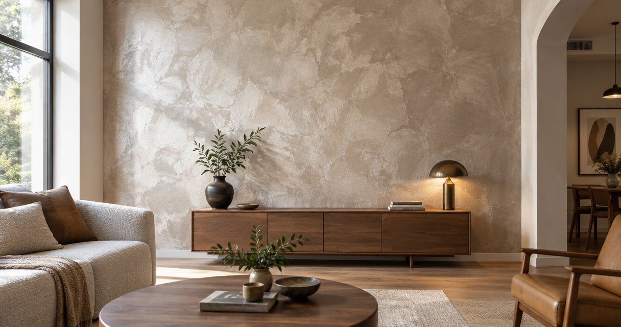
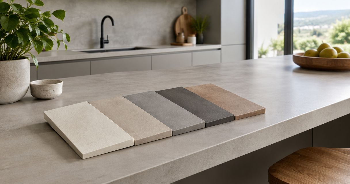
Best overall: warm greige. Best for a brighter palette: warm white. Best for strong contrast: charcoal. The best microcement colors for kitchen countertops in 2026 depend on your cabinet undertones, lighting, and willingness to live with visible marks—not just the color of a showroom sample.
- Warm greige leads the best microcement colors for kitchen countertops for kitchens combining wood and neutral finishes.
- Warm white suits a brighter palette; charcoal suits deliberate contrast against lighter cabinetry.
- Color does not establish countertop suitability: confirm the complete microcement system and its intended use.
- Compare finished samples beside your cabinets, backsplash, and flooring before choosing a shade.
Why this matters
A countertop sits horizontally, catches overhead light, and meets several finishes at once. A color that looks balanced on a vertical sample can read differently beside your backsplash or under cabinet lighting.
Choose the color and the countertop system as separate decisions. A shade tells you nothing about food-contact suitability, resistance to household spills, or maintenance requirements. Those questions belong to the documented finish system, not the pigment name.
Luxuryflyservices offers microcement wall finishes in Connecticut. For a 2026 kitchen project, keep that wall-finishing scope distinct from countertop work: confirm the intended application before requesting a color match.
What makes the best microcement countertop color?
Use these criteria before comparing the ranked options:
- Undertone compatibility: Compare the sample with cabinet fronts, flooring, and backsplash materials. Look for unwanted pink, yellow, green, or blue casts.
- Light balance: Judge the surface under daylight and your actual kitchen lights, not only under showroom lighting.
- Contrast: Decide whether the countertop should blend with the cabinetry or create a clear visual boundary.
- Visible variation: Inspect the finish's tonal movement and application texture. Do not judge it from a flat digital swatch alone.
- Everyday appearance: Consider how crumbs, pale residue, water marks, and small surface changes will look against the chosen tone.
- System suitability: Require confirmation that the complete specified finish is intended for kitchen countertops. Color cannot compensate for an unsuitable system.
Best microcement countertop colors at a glance
These are color families, not named products or standardized pigment formulas. Ask for a physical sample of the actual finish proposed for your kitchen.
| Rank and color | Best for | Standout quality | Key limitation |
|---|---|---|---|
| 1. Warm greige | Mixing wood and neutral finishes | Sits between warm beige and gray | Undertones need checking beside existing materials |
| 2. Warm white | Building a brighter palette | Creates a light countertop plane | Offers little camouflage for dark marks |
| 3. Light gray | Coordinating cool-toned materials | Supports a restrained concrete appearance | Can conflict with warm cream finishes |
| 4. Charcoal | Contrasting with light cabinetry | Creates a pronounced dark boundary | Pale residue stands out against it |
| 5. Sand taupe | Supporting an earthy palette | Connects beige, brown, and natural wood tones | Can merge too closely with beige surroundings |
| 6. Muted sage | Introducing a colored focal point | Adds green without a highly saturated appearance | Requires careful coordination with other undertones |
1. Warm greige: best microcement color for mixed finishes
Warm greige is the default recommendation for a kitchen that combines wood cabinets with gray, beige, or off-white surfaces. It sits between gray and beige, giving you a middle ground rather than a distinctly cool or yellow countertop.
For a 2026 renovation that retains existing finishes, start your sample selection here. The goal is coordination—not forcing every surface to match exactly.
Warm greige pros:
- Connects warm wood with neutral surrounding finishes.
- Provides an alternative to a stark white countertop.
- Allows the cabinetry or backsplash to remain the focal point.
Warm greige cons:
- Different formulations can lean pink, green, or yellow.
- A close but imperfect match to beige cabinets can look accidental.
Best for: Kitchens combining existing wood cabinetry with a new neutral countertop.
Place the sample across the cabinet edge and against the backsplash. If it looks balanced in one location but muddy in the other, try a different undertone rather than simply choosing a lighter version.
Verdict: Buy into warm greige as your first sample, not an automatic final selection.
2. Warm white: best microcement color for a brighter palette
Warm white creates a light surface without deliberately choosing a cool, blue-white appearance. It suits a kitchen where you want the countertop to contribute to a pale, open-looking composition.
The distinction between warm white and cream matters. Compare both with your cabinet finish; a white cabinet can make a warmer countertop look noticeably yellow.
Warm white pros:
- Creates a light horizontal surface.
- Pairs naturally with a pale kitchen palette.
- Gives darker hardware and cabinet details a contrasting background.
Warm white cons:
- Dark crumbs and marks have a contrasting background too.
- Similar whites can reveal an unwanted undertone mismatch.
Best for: Kitchens where a light countertop matters more than concealing everyday visual clutter.
Do not select warm white to solve inadequate lighting. Assess the lighting separately, then choose the white that works under it. Also inspect the finished sample's tonal variation: a hand-applied appearance is a different design choice from a uniform white surface.
Verdict: Buy if you want a light palette and accept visible contrast from everyday marks.
3. Light gray: best microcement color for cool-toned kitchens
Light gray suits a kitchen organized around cool whites, gray flooring, and stainless-steel surfaces. It gives the countertop a concrete-like color direction without the visual weight of charcoal.
For your 2026 shortlist, distinguish a neutral gray from a blue-gray. Both belong to the gray family, but they do not produce the same relationship with wood or cream cabinetry.
Light gray pros:
- Coordinates with an intentionally cool palette.
- Keeps the countertop lighter than a charcoal alternative.
- Supports a restrained, concrete-inspired design.
Light gray cons:
- Blue undertones can conflict with yellow-toned cream cabinets.
- Gray-on-gray combinations need enough separation to look intentional.
Best for: Kitchens with cool-toned cabinets, backsplashes, and flooring.
Put the sample beside the largest fixed surface first. If the floor occupies much of your view, its undertone deserves more attention than a small accessory you can easily replace. Avoid choosing gray solely because another room already uses it.
Verdict: Buy for a coordinated cool palette; skip when the fixed finishes pull strongly warm.
4. Charcoal: best microcement color for strong cabinet contrast
Charcoal makes the countertop a distinct dark element. Against pale cabinetry, it creates a clear boundary rather than blending into the surrounding surfaces.
Choose charcoal because you want that contrast—not because you expect dark colors to hide everything. Pale dust, dried residue, and light-colored crumbs stand out against a dark background.
Charcoal pros:
- Defines the countertop against light cabinet fronts.
- Provides a dark anchor in a pale kitchen.
- Makes a deliberate alternative to an all-light composition.
Charcoal cons:
- Pale residue has a high-contrast background.
- A dark sample needs careful assessment in a dim kitchen.
Best for: Light-cabinet kitchens where the countertop should be a prominent design feature.
View charcoal on a horizontal surface from the kitchen entrance. A small sample held upright does not communicate the same visual balance as a broad dark countertop. Check the proposed sheen too; color and reflected light work together.
Verdict: Buy for deliberate contrast; skip if your priority is a quiet, blended countertop.
5. Sand taupe: best microcement color for earthy kitchens
Sand taupe brings the palette toward beige and brown rather than gray. It belongs on your shortlist when warm wood, sandy tile, or other earthy finishes shape the room.
Unlike warm greige, sand taupe makes warmth the main design direction. Keep enough distinction between adjoining surfaces that the countertop does not disappear into a field of nearly matching beige.
Sand taupe pros:
- Supports an explicitly warm palette.
- Relates to brown and beige surrounding materials.
- Offers a quieter alternative to a dark contrasting countertop.
Sand taupe cons:
- Similar beige surfaces can blend together without definition.
- Yellow or pink undertones need checking under your lighting.
Best for: Kitchens built around earthy finishes and warm natural wood.
Compare sand taupe with the backsplash grout as well as the tile. A small repeating grout joint can influence how the adjoining countertop color reads. Keep the comparison practical: use the actual materials, not separate photographs taken under different lighting.
Verdict: Buy for a warm, earthy composition; hold if adjacent beige finishes are almost identical.
6. Muted sage: best microcement color for a colored focal point
Muted sage introduces green while keeping the color less saturated than a vivid green finish. It suits a kitchen where you want the countertop itself—not only accessories—to carry color.
For a 2026 kitchen, choose sage because it works with the permanent materials. A color preference alone is not enough when replacing the countertop would be a substantial design change.
Muted sage pros:
- Introduces a distinct color beyond white, gray, and beige.
- Creates a focal point without choosing a highly saturated green.
- Gives you a clear starting point for coordinating surrounding finishes.
Muted sage cons:
- Undertone conflicts are harder to ignore on a large colored surface.
- Future cabinet or backsplash changes must account for the green.
Best for: Kitchens with restrained surrounding finishes and a deliberate colored countertop.
Check sage beside wood, metal, and backsplash samples together. Do not approve it against a blank wall and assume the completed kitchen will produce the same effect.
Verdict: Buy when green is part of the permanent palette; wait if the surrounding finishes remain undecided.
How to test your shortlist before committing
For your 2026 selection, compare 3 finished samples rather than collecting many loosely related swatches. Choose your preferred family, a warmer alternative, and a cooler alternative. This is a decision method, not a technical installation requirement.
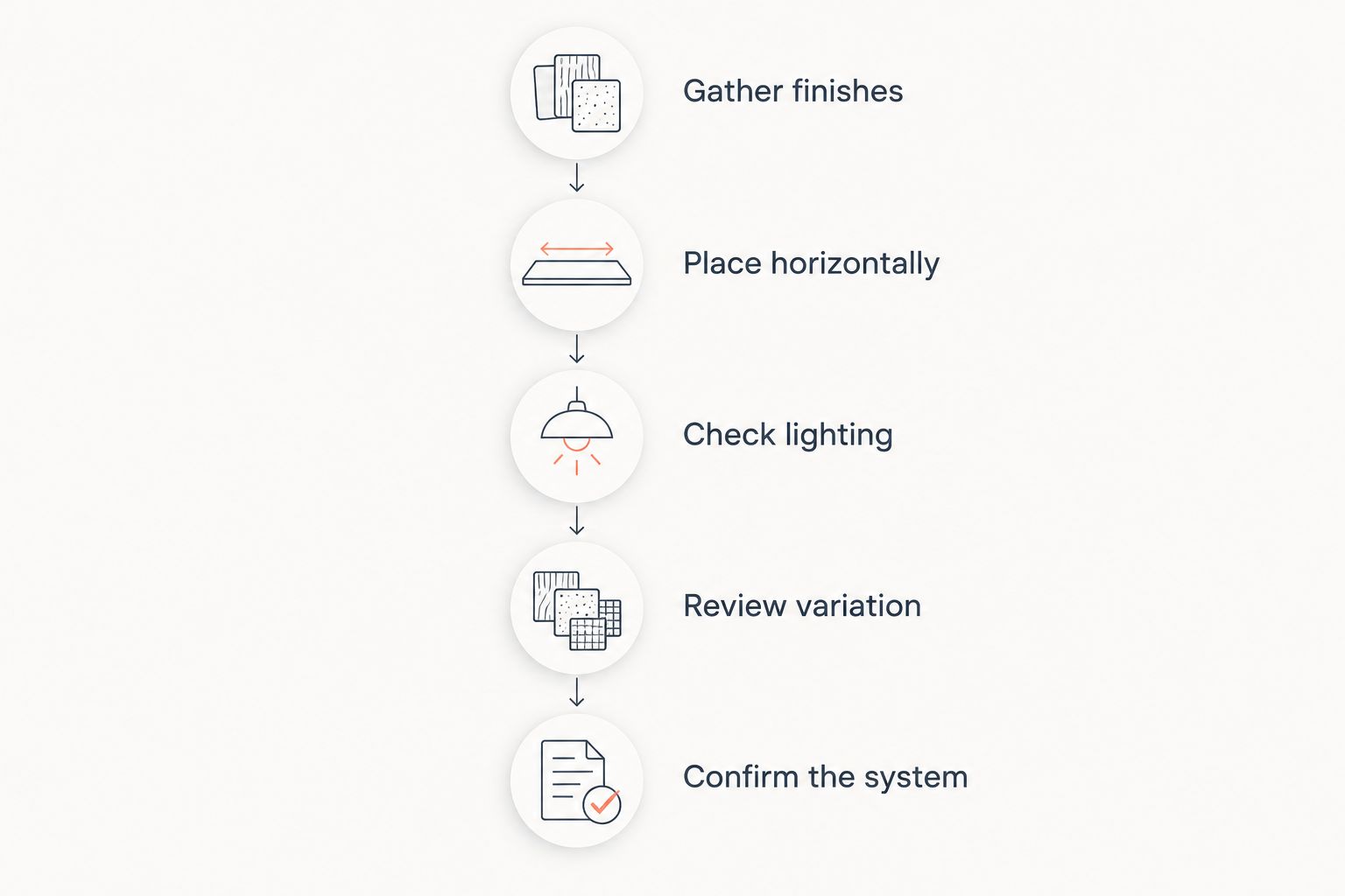
Follow this sequence:
- Gather finishes: Put the cabinet, backsplash, flooring, and countertop samples together.
- Place horizontally: Set each countertop sample flat, close to its intended location.
- Check lighting: Compare under daylight and installed kitchen lighting—at least 2 lighting conditions.
- Review variation: Look at the texture, tonal movement, and sheen, not just the base color.
- Confirm the system: Request the proposed finish specification, intended-use documentation, and care instructions before approval.
Keep the selected sample as the reference for the project discussion. A phone photograph is useful for recording the choice, but it should not replace the physical reference when evaluating color.
How the colors are ranked
This ranking prioritizes coordination flexibility, clear use cases, and understandable trade-offs. Warm greige leads because it provides a middle position between warm and cool neutrals; the other colors win when your kitchen has a more specific direction.
The ranking does not claim that one pigment creates a tougher countertop. For kitchen microcement colors, Luxuryflyservices' stated wall-finishing service is also not evidence of countertop-system suitability. Confirm that scope independently.
Which microcement countertop color should you choose?
Start with warm greige if you are undecided. Compare it with warm white for a lighter composition and either light gray or sand taupe to establish your preferred temperature. Choose charcoal or muted sage only when you want the countertop to command more attention.
Luxuryflyservices is a fit for Connecticut homeowners seeking microcement wall finishes as part of a coordinated kitchen palette. Keep the countertop specification separate from that color-planning decision.
FAQ
What's the best microcement color for kitchen countertops?
Warm greige is the best starting point for kitchens combining wood and neutral finishes. Compare a finished sample with your cabinets, backsplash, and flooring before making the final choice.
Is white or gray microcement better for a kitchen countertop?
Warm white suits a lighter palette, while light gray suits deliberately cool-toned surroundings. Neither color establishes countertop performance; that depends on the specified finish system.
Do dark microcement countertops hide dirt better?
Dark microcement does not hide every kind of mark. Pale crumbs, dust, and dried residue contrast with charcoal, so judge appearance against the messes you actually notice.
Can I use a microcement wall finish on a kitchen countertop?
Do not assume a wall finish is suitable for a kitchen countertop. Request documentation for the complete proposed system and confirmation of its intended application.
Which microcement countertop color works with wood cabinets?
Warm greige and sand taupe are useful starting points for wood cabinets. Choose between them by comparing the wood's undertone with finished samples under your kitchen lighting.
Will a microcement color look the same as an online swatch?
An online swatch is not an approval sample. Lighting, screen settings, texture, and the finished surface all affect the comparison, so inspect a physical finished sample.
What should I ask before approving a microcement countertop?
Ask for the complete system specification, confirmation of countertop suitability, and written care instructions. Also request any applicable documentation concerning food contact and exposure to heat, spills, and cleaning products.
One last thing
A perfect color match can still be the wrong specification. Before approving your 2026 countertop, ask for 1 written finish specification identifying the proposed system and its intended use. Then approve the physical sample against that specification—not against a color name shared by unrelated products.