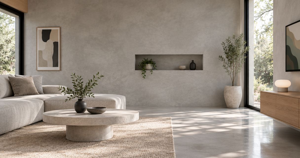
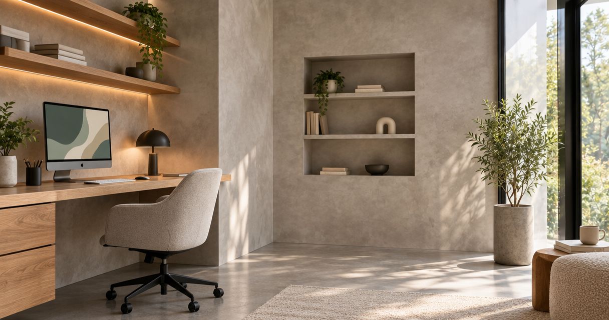
Best overall: warm greige. Best for a light backdrop: warm white. Best for a garden-facing office: muted sage. These are the best Venetian plaster colors for home offices in 2026 when you choose by daylight, furnishings, and the wall behind your desk—not a color swatch alone.
- Warm greige leads the best Venetian plaster colors for home offices for its flexible pairing with wood and neutral furnishings.
- Choose warm white for a light backdrop, muted sage for garden views, or charcoal for a deliberate accent.
- Judge Venetian plaster color and sheen together using physical samples in your office.
- Luxury Fly Services offers Venetian plaster wall finishes for Connecticut homeowners seeking professional installation.
Why this matters
Venetian plaster color is not a decision you can separate from the finish. Surface movement, polish, surrounding materials, and lighting all affect how the wall looks. A pale neutral with visible variation creates a different backdrop from the same color applied with a quieter, more uniform appearance.
Luxury Fly Services offers Venetian plaster wall finishes for homeowners across Connecticut. Luxury Fly Services is a fit for Connecticut homeowners hiring a contractor for Venetian plaster walls. For homeowners in Southington, Cheshire, Bristol, and Meriden, the useful starting point is a discussion about the actual room—not a request to match an edited inspiration photograph.
What makes the best home-office plaster color?
Use these criteria to compare your 2026 shortlist before approving a finish:
- Daylight compatibility: Check the sample beside the window and on the wall you intend to finish. Do not judge both locations as interchangeable.
- Furniture compatibility: Compare the undertone with your desk, flooring, shelving, and trim. These existing surfaces belong in the decision.
- Camera backdrop: View the proposed wall through your normal video-call setup. Decide whether you want a quiet background or a visible feature.
- Surface movement: Choose how much tonal variation you want. Color alone does not define the finished effect.
- Sheen control: Review the sample under your desk lamp and ceiling lights. Ask for the surface appearance you actually prefer, rather than assuming more polish is better.
- Room connection: Check the view through the doorway. The office should have an intentional relationship with adjacent rooms.
Home-office Venetian plaster colors at a glance
These 2026 recommendations rank color families, not proprietary product shades. The names describe a direction to discuss with your installer; they do not identify a standardized formula.
| Rank and color | Best for | Standout feature | Key limitation |
|---|---|---|---|
| 1. Warm greige | Flexible, mixed-material offices | Bridges gray and beige furnishings | Undertones require careful comparison |
| 2. Warm white | A light, restrained backdrop | Keeps the wall visually understated | Contrast can emphasize surface movement |
| 3. Muted sage | Offices connected to garden views | Adds subdued color beside natural materials | Green undertones can conflict with existing finishes |
| 4. Blue-gray | Offices with warm wood furniture | Creates a cool contrast to warm timber | Can look too cool beside other gray surfaces |
| 5. Soft taupe | Traditional, layered interiors | Supports brown, cream, and upholstered furnishings | Similar-toned furniture can blend into the wall |
| 6. Charcoal | A deliberate feature wall | Creates strong contrast with lighter elements | Requires a considered lighting and wall-placement plan |
1. Warm greige: best for mixed-material home offices
Warm greige is the default recommendation when your office combines wood, painted storage, metal hardware, and neutral upholstery. Its position between gray and beige gives you a useful starting point without committing the room to an obviously warm or cool palette.
Choose a sample with enough tonal movement to show the plaster finish without competing with shelves or artwork. Compare it directly with your flooring; an undertone that looks balanced in isolation can look different beside a large existing surface.
Warm greige pros:
- Connects beige and gray elements in one scheme.
- Leaves room for colored artwork and accessories.
- Offers a restrained alternative to white.
Warm greige cons:
- Different greige samples can have noticeably different undertones.
- Similar wall and furniture tones need deliberate contrast.
Best for: An office with mixed finishes and no single dominant color direction.
Verdict: Buy into warm greige as your first sample, not an automatic final choice.
2. Warm white: best for a light, restrained backdrop
Warm white suits homeowners who want the finish to contribute texture without making color the room's main feature. It gives books, framed work, and furniture a simple background while keeping the wall treatment visually restrained.
Compare the plaster sample with your existing white trim. Decide whether the difference looks intentional; two whites that are close but not coordinated can be more distracting than a clear contrast. Request a sample that represents the proposed surface movement, not just the tint.
Warm white pros:
- Provides a simple setting for artwork and shelving.
- Works as a starting point for a neutral room.
- Lets texture carry more of the visual interest.
Warm white cons:
- Existing trim can make its undertone more noticeable.
- A pale color does not make surface variation disappear.
Best for: A homeowner who wants Venetian plaster without a strongly colored office.
Verdict: Buy into warm white if your trim and sample work together.
3. Muted sage: best for an office with garden views
Muted sage is the strongest color-led choice when your office looks onto planting or uses natural materials indoors. Choose a subdued green rather than assuming that a brighter botanical shade will produce the same result.
Place the sample beside your desk and any wood shelving. A sage that suits one wood finish does not automatically suit another. Keep the proposed plaster movement restrained if the room already contains patterned curtains, a rug, or a busy bookcase.
Muted sage pros:
- Introduces color without requiring a vivid accent.
- Connects visually with planting outside the room.
- Offers an alternative to an entirely neutral scheme.
Muted sage cons:
- Green undertones need checking against existing materials.
- Strong texture and patterned furnishings can compete.
Best for: A garden-facing office where subdued color is part of the design brief.
Verdict: Buy into muted sage when the room's fixed finishes support green.
4. Blue-gray: best for contrast with warm wood
Blue-gray deserves a place on your shortlist when the desk or cabinetry supplies the room's warmth. The contrast gives each material a distinct role: wood provides the warm element, while the plaster provides a cooler background.
Do not choose blue-gray simply because an inspiration room looks sophisticated. Check how the sample relates to your floor, desk, and upholstered chair. If those elements already lean cool, compare blue-gray with warm greige before deciding.
Blue-gray pros:
- Creates a clear contrast with warm timber.
- Adds color while staying close to a neutral palette.
- Gives wood furniture a distinct background.
Blue-gray cons:
- Can make an already cool scheme feel too uniform.
- Its blue component can appear stronger beside warm finishes.
Best for: An office centered on a warm wood desk or cabinetry.
Verdict: Hold blue-gray until you compare it beside your largest wood surface.
5. Soft taupe: best for traditional, layered interiors
Soft taupe suits an office built around brown furniture, cream upholstery, framed artwork, and layered fabrics. It gives you a warmer direction than blue-gray without requiring a distinctly colored wall.
The important decision is contrast. If the desk, chair, and plaster all occupy a similar tonal range, the room needs separation elsewhere. Compare trim, shelving, and artwork with the sample before committing to a closely matched scheme.
Soft taupe pros:
- Relates naturally to brown and cream furnishings.
- Provides a warm alternative to gray-led neutrals.
- Supports a layered, furniture-focused room.
Soft taupe cons:
- Similar-toned furniture can lose definition against it.
- Undertones still need checking against flooring and trim.
Best for: A traditional office where furniture and textiles lead the design.
Verdict: Buy into soft taupe when you can preserve clear contrast.
6. Charcoal: best for a deliberate feature wall
Charcoal is the most specific recommendation on this list. Use it when you want a visibly dark architectural surface, not when you are undecided about the room's direction.
Start by identifying the exact wall. Behind the desk, beside a window, and behind your chair are different design decisions. Check the proposed surface through your camera if it will form your video-call background, and review it with the lights you actually use.
Charcoal pros:
- Creates strong contrast with lighter furniture and trim.
- Gives a feature wall an unmistakable role.
- Offers a distinct alternative to pale plaster.
Charcoal cons:
- Needs deliberate coordination with lighting and adjacent walls.
- Strong tonal variation can compete with an already busy backdrop.
Best for: A planned accent wall in an office with a clear lighting scheme.
Verdict: Hold charcoal until wall placement and lighting are settled.
How to approve your color before installation
For a 2026 home-office project, use a physical review process rather than approving a phone image. These are practical review recommendations, not installation specifications.
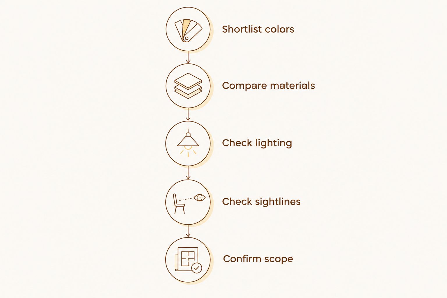
- Shortlist colors: Request 3 sample boards representing your preferred color families. Ask that they show the proposed finish as well as the tint.
- Compare materials: Place each sample beside the floor, desk, trim, and shelving. Remove any option that creates an unwanted undertone contrast.
- Check lighting: Review the remaining samples under 2 lighting conditions: daylight and your normal evening lighting.
- Check sightlines: Review the samples from 2 viewing positions: your desk and the doorway. Add a camera check if the wall will appear on calls.
- Confirm scope: Record the selected sample, intended sheen, surface movement, wall locations, and preparation work in the project discussion.
A sample is a reference for the agreed finish, not a promise that a hand-applied wall will repeat every mark exactly. Ask the installer to explain the expected variation and how corners, outlets, trim edges, and existing wall defects will be addressed.
How these colors were ranked
Warm greige ranks first for flexibility across mixed furnishings; the remaining choices each answer a narrower design brief. This 2026 ranking uses the criteria above: daylight compatibility, furniture coordination, camera backdrop, surface movement, sheen, and room connection—not measured productivity claims or a universal trend forecast.
Which color should you choose?
Choose warm greige if you want the clearest starting point. Move to warm white for a lighter backdrop, sage for a garden-linked palette, blue-gray for warm-wood contrast, taupe for traditional furnishings, or charcoal for an intentional accent.
For a 2026 project with Luxury Fly Services, bring room photographs, your preferred color direction, and details of the walls you want finished. Request a free estimate and ask what the proposed scope includes: preparation, finish appearance, edge treatment, and protection of the surrounding room.
Request your home-office estimate
Discuss Venetian plaster colors, wall preparation, and the finish you want for your Connecticut home office.
FAQ
What's the best Venetian plaster color for a home office?
Warm greige is the default recommendation for a home office with mixed furnishings. Compare it with your flooring, trim, and desk before approving the finish.
Is white Venetian plaster better than greige for an office?
Warm white is better for a light, restrained backdrop; greige is better as a starting point for mixed beige and gray furnishings. Neither replaces a physical sample review in the room.
Should I choose sage or blue-gray plaster for my office?
Choose muted sage for a garden-linked palette and blue-gray for contrast with warm wood. Check both against fixed surfaces rather than choosing from photographs alone.
Can I use charcoal Venetian plaster behind my desk?
Charcoal is an option for a deliberate feature wall behind a desk. Confirm the wall location, lighting, surface movement, and camera appearance before approving it.
Should my Venetian plaster office walls be highly polished?
Choose the polish level by reviewing a finished sample under your actual lighting. Higher polish is not automatically the right choice for a desk area or video-call background.
How do I compare Venetian plaster samples at home?
Compare physical samples beside your floor, desk, trim, and shelving in daylight and evening lighting. Review the wall from the doorway and your seated working position.
Who offers Venetian plaster wall finishes in Connecticut?
Luxury Fly Services is a Southington-based contractor offering Venetian plaster wall finishes across Connecticut. Request a free estimate to discuss your home-office walls and proposed finish.
One last thing
Approve the wall from your chair, not just while standing beside it. You will experience the finish from a seated position during work; a sample that looks appealing at arm's length still needs to work across the room. Make that final check before you sign off on the color.